Jargon
Designing a browser extension for recruiters to better understand veteran candidates
1 min skim | 8 min read
Skills
Market Research
Participatory Design
UX Research
Usability Testing
Support (solo capstone project)
8 product designers
1 design mentor
Duration
3 months, 2022
Tools
Figma
Miro
Google Survey
Overview
Jargon is a SaaS startup focused on veteran recruiting. Fall of 2022, I was tasked with redesigning their newly released recruiter-facing experience.
Role: Product Design Consultant
Conduct market research to determine product-market fit. Lead participatory design research to identify product point-of-entry. Design a browser extension as an MVP.
How it began
This was the intriguing question our client Jargon, a SaaS startup from Boston, brought to us. All information in this case study is my own and does not necessarily reflect the views of Jargon.
Solution summary
01
Integration with Applicant Tracking Systems (ATS)
Seamless integration into the user workflow with minimal disruption is possible through the form of a browser extension.
02
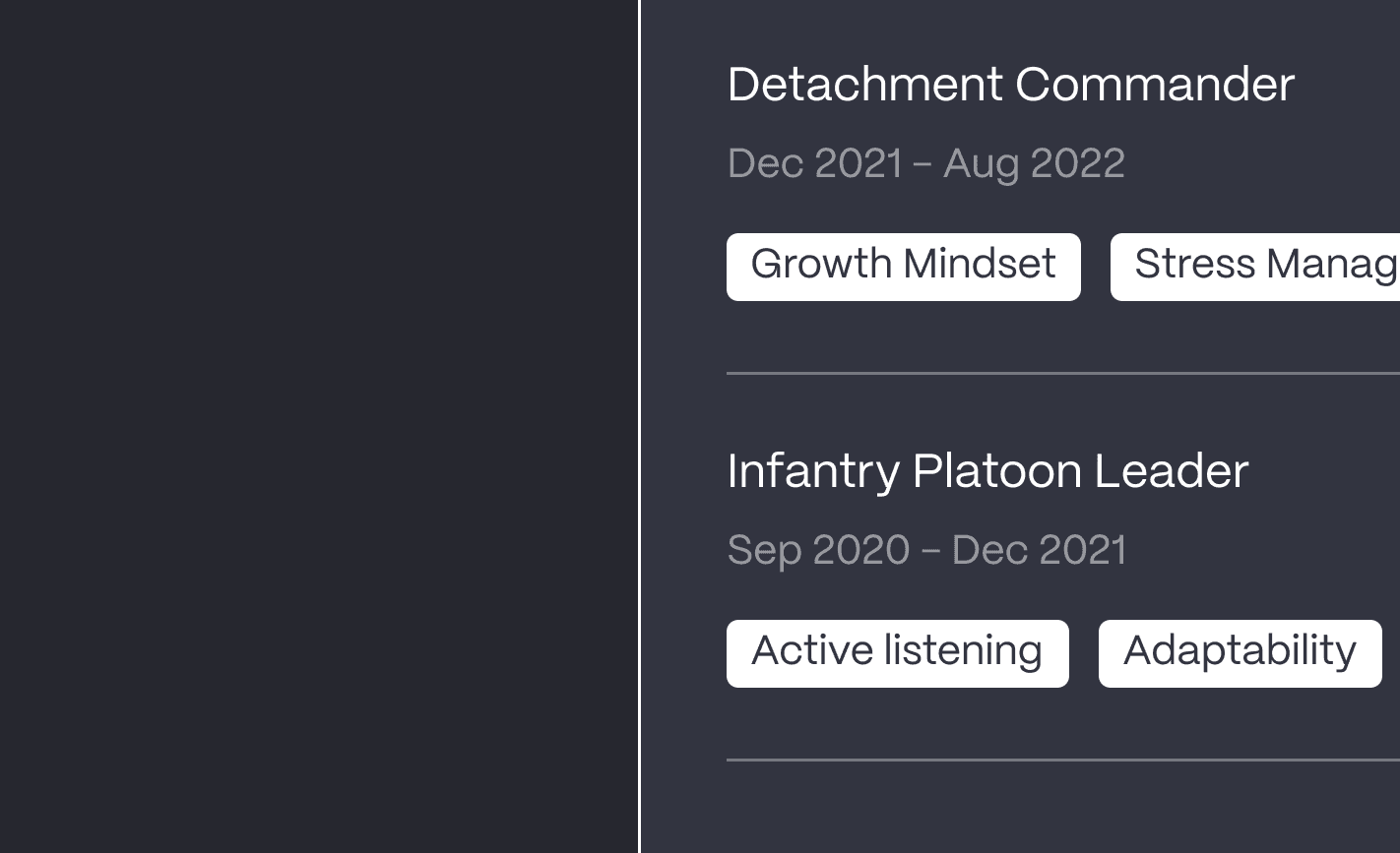
Quick summary highlighting soft skills
Recruiters can quickly access key highlights of a candidate.
03
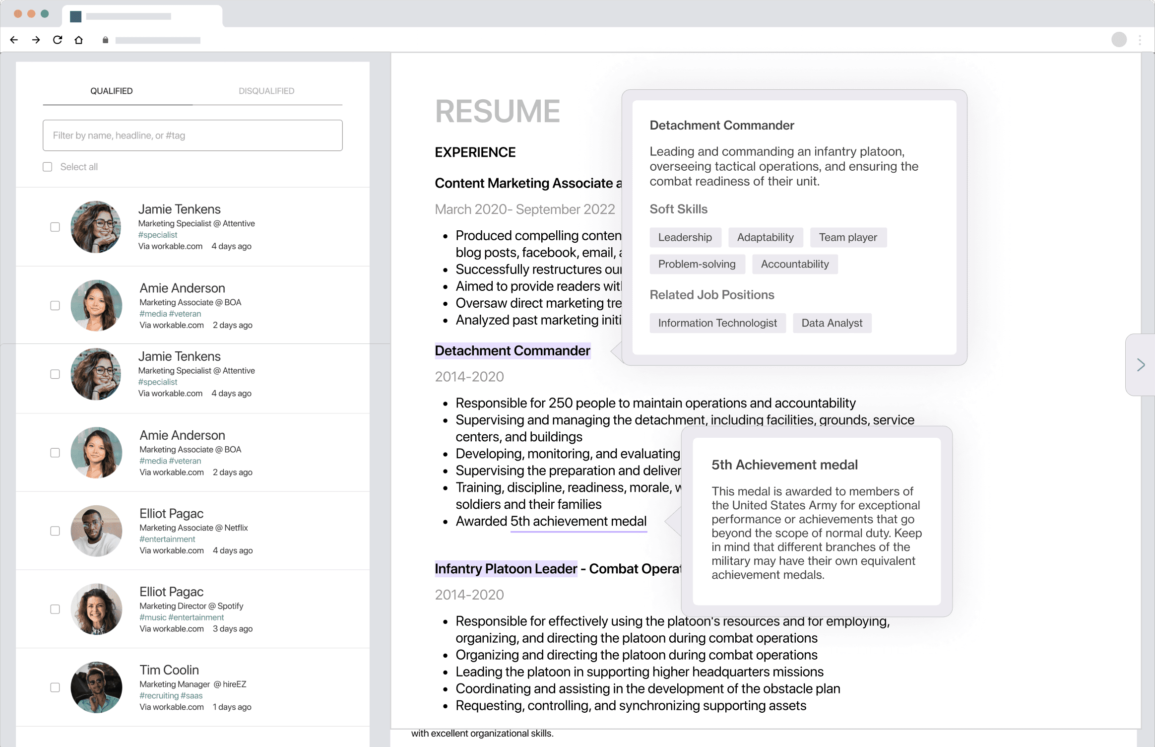
Military experience & terminologies explained
In-depth dissection of military terminologies to aid resume screening
my role
Business-Informed Design Approach
My role for this project is to design a simple, quickly feasible solution and test it, evaluate user feedback, and formulate next steps. Unique to this project is the underlying business problem we were trying to solve, which is why I conducted in-depth market research and participatory design sessions to understand how my designs impact business needs.
The problem
Jargon initially targeted veterans by providing them with resume tailoring and position matching. Upon collecting veteran candidate data, Jargon wanted to jump into the recruiters side, which is why they released their Enterprise Solution product.
Jargon came to us with the specific goal to restructure their recruiter experience.
Enterprise Solution page on Jargon.xyz
Validating assumptions
Because we're serving a different group of users(recruiters) Jargon initially was targeting(veterans), we needed to think through and validate client biases and assumptions.
Is there an underemployment problem?
43%
of veterans leave their first job after one year, with the number jumping to 80% after two years.
67%
of veterans reported not finding work equal to their military experience level
33%
of veterans still feel underemployed today
But…
Why is there an underemployment problem?
Lack of DEI focus
Large players in HR tech are unable to focus on the specific needs of the veteran population
Skillset unfamiliarity
80% of recruiters have a low confidence in identifying veteran transferable skills
If underemployment is a problem…
Why have current solutions failed to address this problem?
Mainly veteran-facing solutions
Majority of solutions provide veterans with resume help and networking communities, but none target change for recruiters.
Hiring Our Heroes landing page
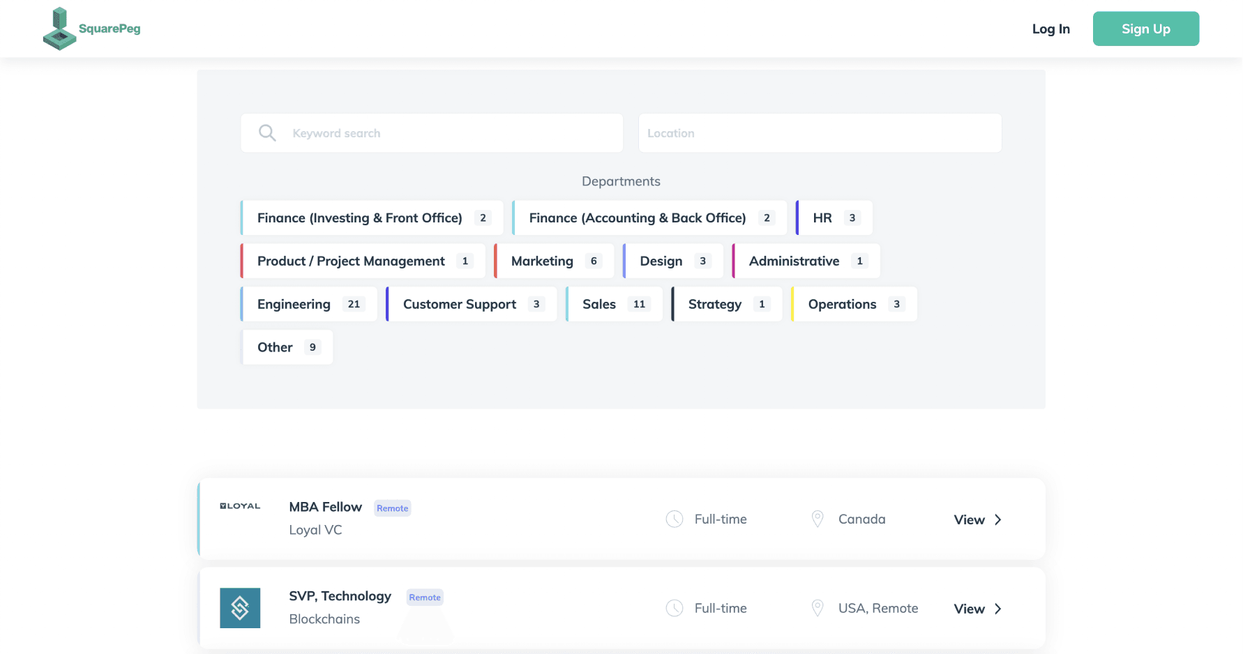
DEI filters are insufficient
Without an understanding of military terminologies, filters provide very little help for recruiters.
SquarePeg candidate filters
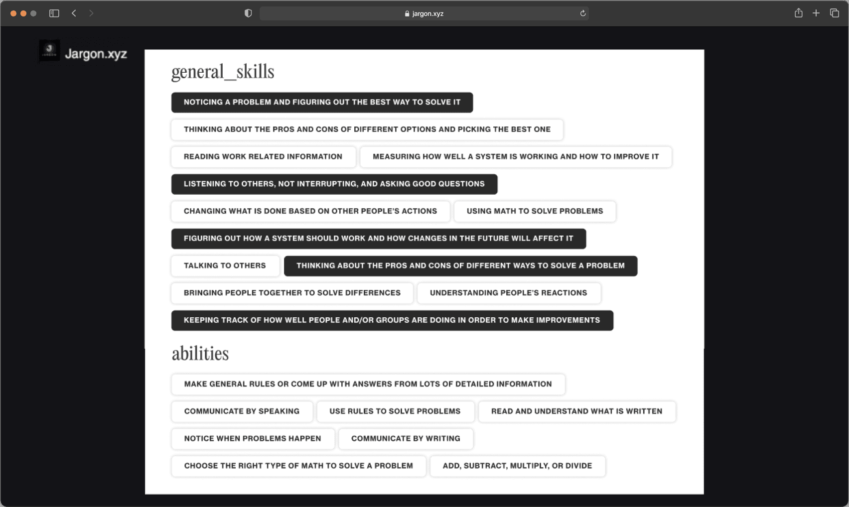
Jargon's current experience
According to Miller's Law, the average person can only process about 7 pieces of information at a time. Yet, the Jargon interface presents over 30 elements at a time, of comparable significance, without clear groupings, causing information overload.
Current product: candidate skills page
Synthesizing findings
Based on my external market and internal design audit of the current product, I synthesized the findings into actionable design constraints and decisions.
How might we provide recruiters with the right amount of information to encourage shortlisting qualified veteran candidates?
Translating insights into design guidelines
Insights
Design decisions
Design strategy
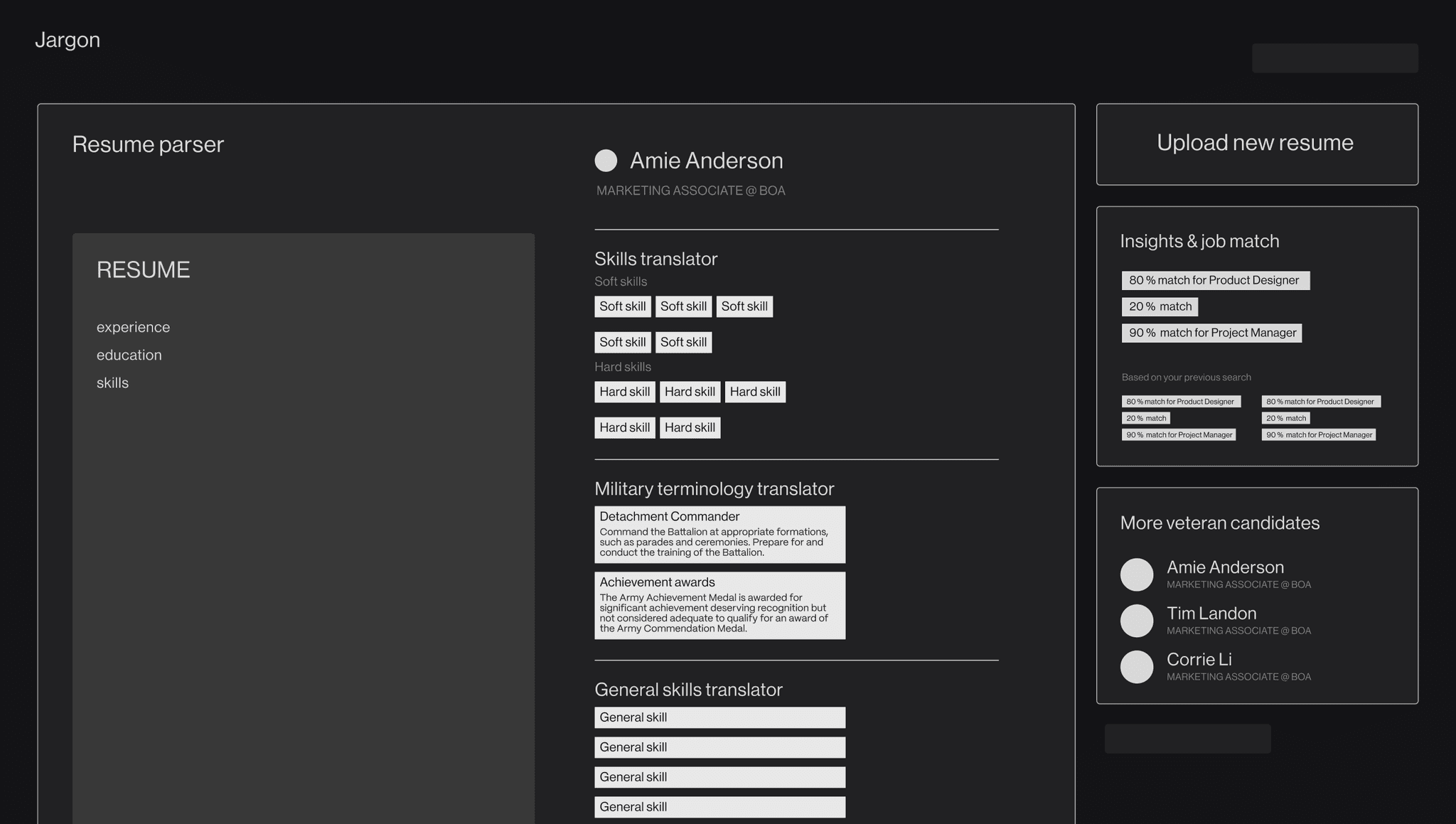
My first (failed) attempt: insights dashboard
Initial explorations featured a dashboard design where I condensed the content into one page with candidate insights, but users were confused as to why they would spend so much time with just one candidate.
Mid-fidelity dashboard
Key learnings
01
Cross-platform toggle between Jargon and ATS for each candidate causes lots of friction
02
Dashboard is an overkill that continued to cause information overload
Back to research: reducing friction
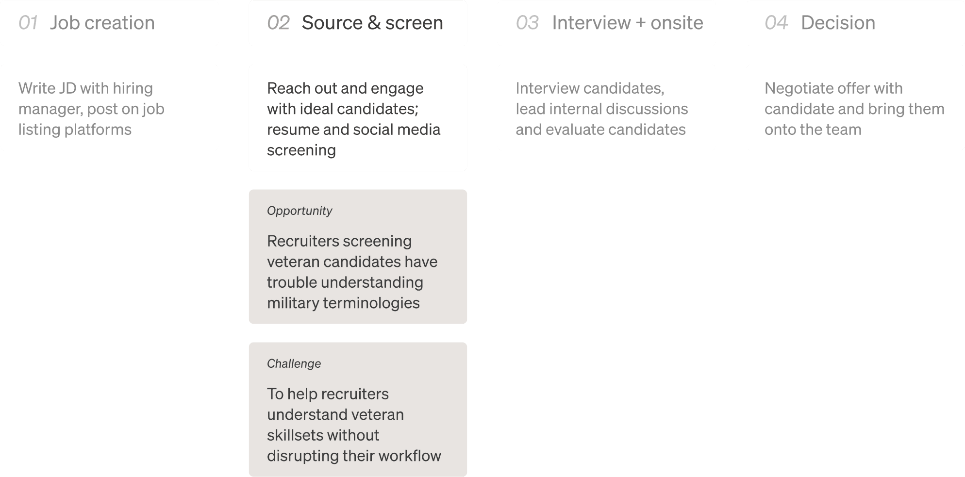
I shifted my focus to finding an ideal entry point for Jargon in the recruiter user journey. I found that recruiters were highly satisfied with their current workflow, which means introducing a new platform specifically focused on veteran recruiting was adding friction.
Recruiter journey flow
Round 2 of research
7 interviews
Method
Participatory design research: Magic Button & Card Sorting.
Goal
Understand user journey.
Find an entry point for Jargon.
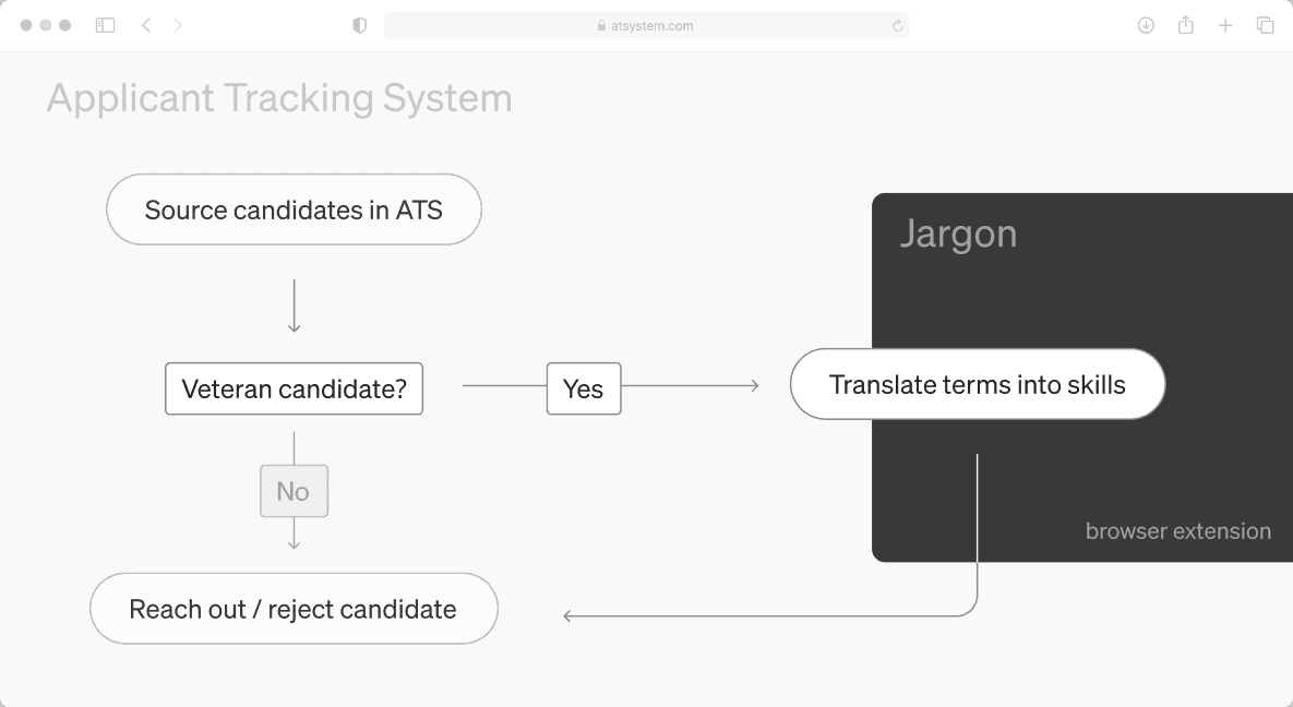
I also found that recruiters relied heavily on Applicant Tracking Systems (ATS), which means Jargon would be competing with ATS giants. I needed to find a better way to slide Jargon into the recruiter workflow.
At some point, I started to question if a new platform is really the best solution format…
A new direction!
With focus shifted to designing an experience that is seamlessly integrated into the current recruiter workflow, I drafted my second attempt. A browser extension not only is ideal for users, but also is a great way for Jargon to test the market at a lower cost.
BEFORE
AFTER
Seamless integration
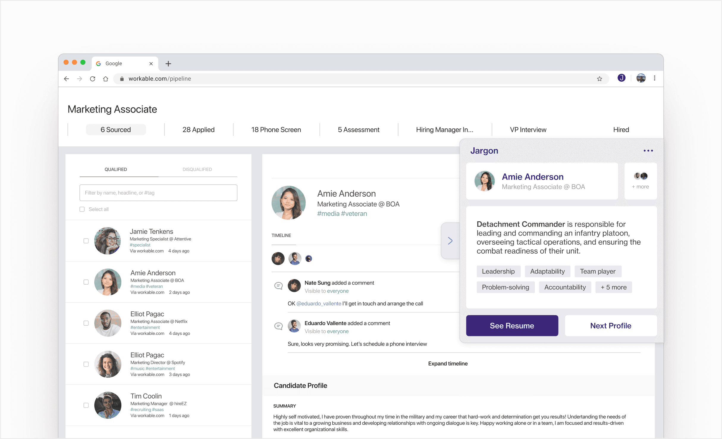
A browser extension can help recruiters quickly access the information they need, without leaving their ATS.
Browser extension
How quickly a user can enter, navigate, exit, and re-enter Jargon is key. With a goal to test the market, the focus is not on providing recruiter with very details content, but rather a quick and easy tool for recruiters to just try it out.
Restructuring expectations
Business alignment
Get a foot in the door
In the early stages of a new concept, testing the product is more important than building a complete product. A browser extension allows Jargon to test out the product without asking too much from users.
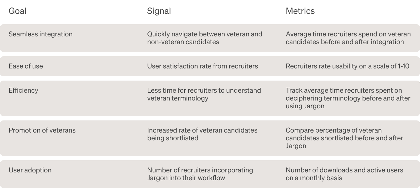
New success metrics
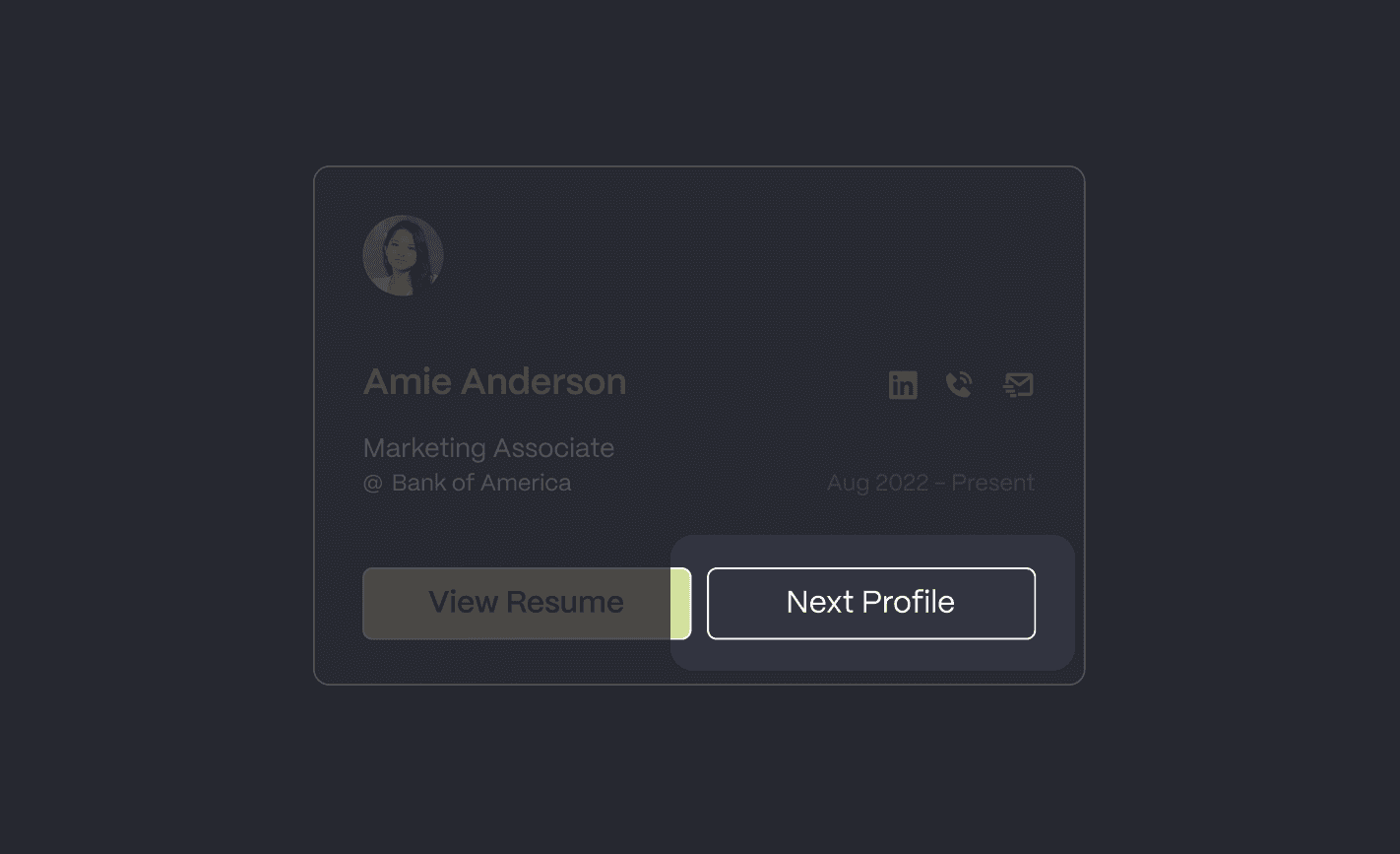
Simplified 3-step flow
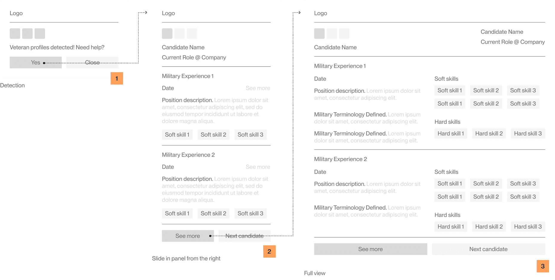
With a new direction, I built out a user flow that would simplify the way users interact with Jargon.
Mid-fidelity 3-step flow
TESTING
Round 1 testing: content
How much content to display goes back to the root problem of information overload. Since browser extensions have much less real estate for content, I needed to test and see how users respond to different lengths of contents for the quick summary page.
Shorter summary received 25% more engagement
high-fidelity testing: shorter summary page
Progressive disclosure
Revealing information gradually can help manage the cognitive load.
Less is more
User reflected that content they could find in resume (i.e. hard skills) should be taken out to declutter the space.
Round 2 testing: use cases
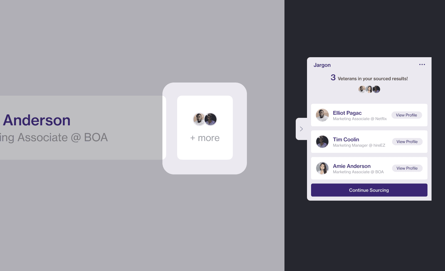
Multiple veteran candidates
Use case: multiple veteran candidates
"What if I encounter more than one veteran candidate in my talent pool?"
BEFORE
AFTER
Slide in & slide out panel
Use case: exit and re-entry
"If I quit Jargon, how do I get back to where I was before?"
BEFORE
AFTER
Light mode
Use case: ATS visual integration
"It feels a bit out of place if I'm using Workable and then Jargon because one is so bright and light, the other is super dark."
BEFORE
AFTER
final design
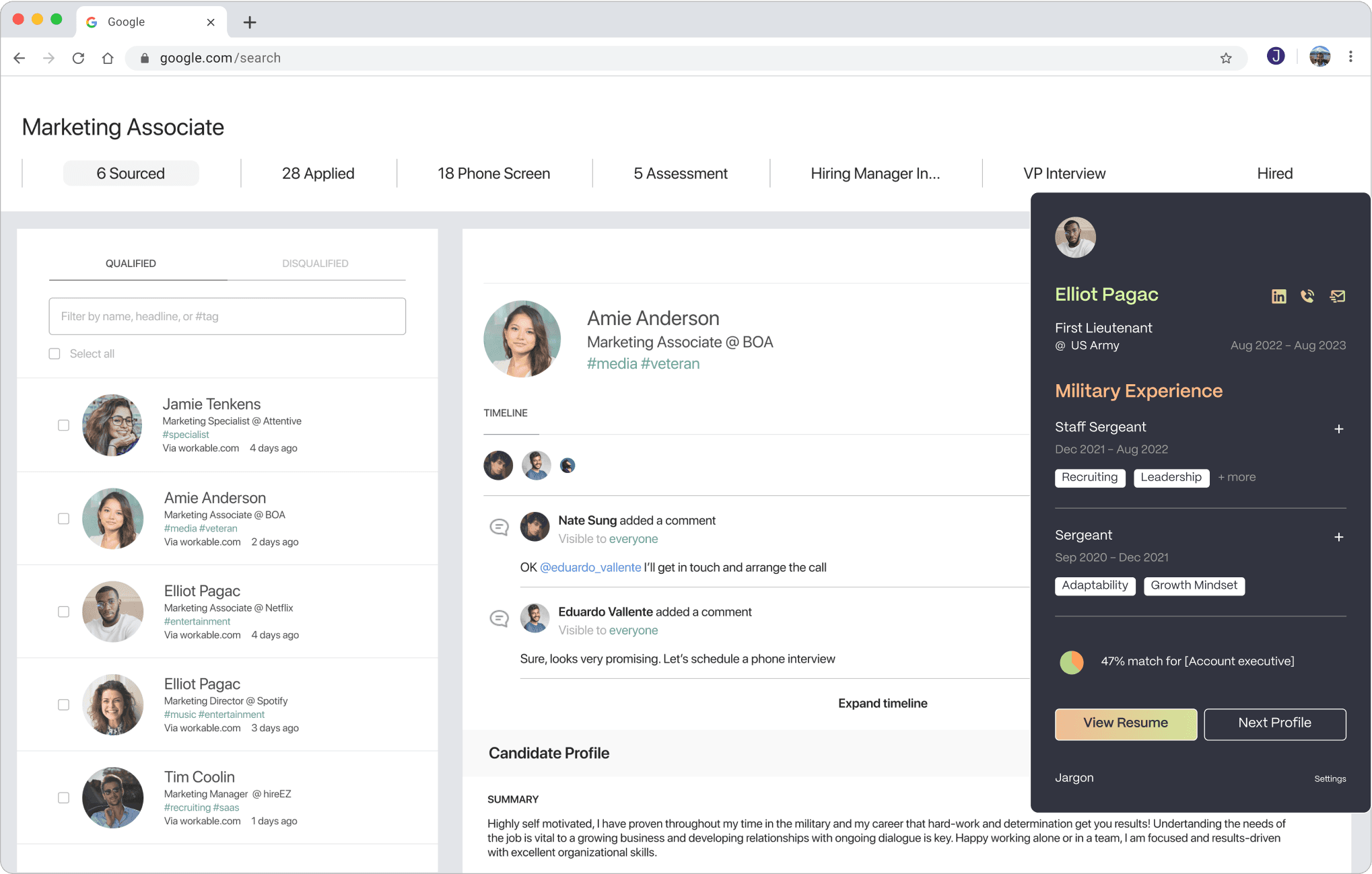
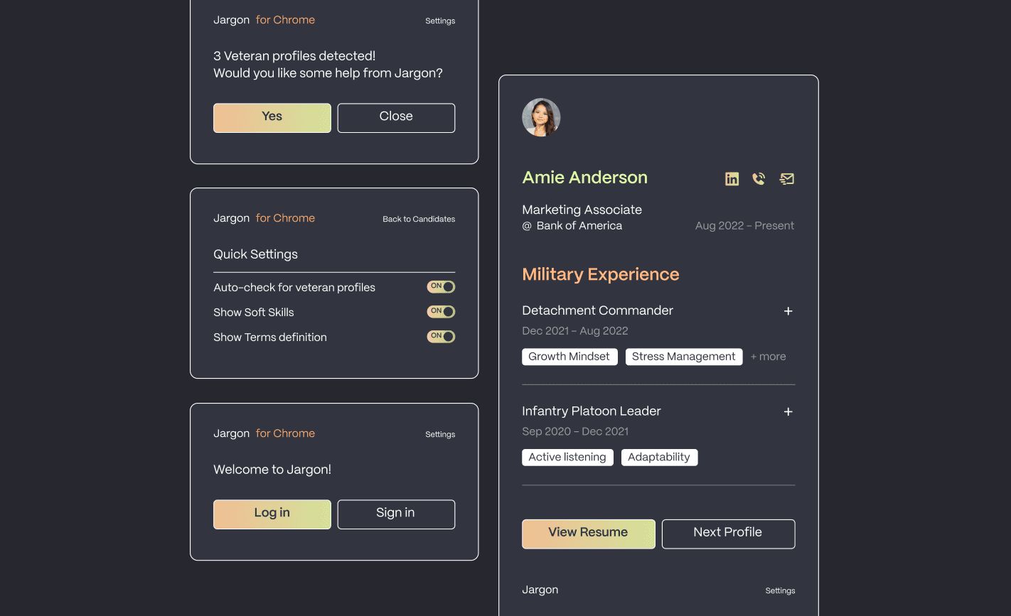
Final solution
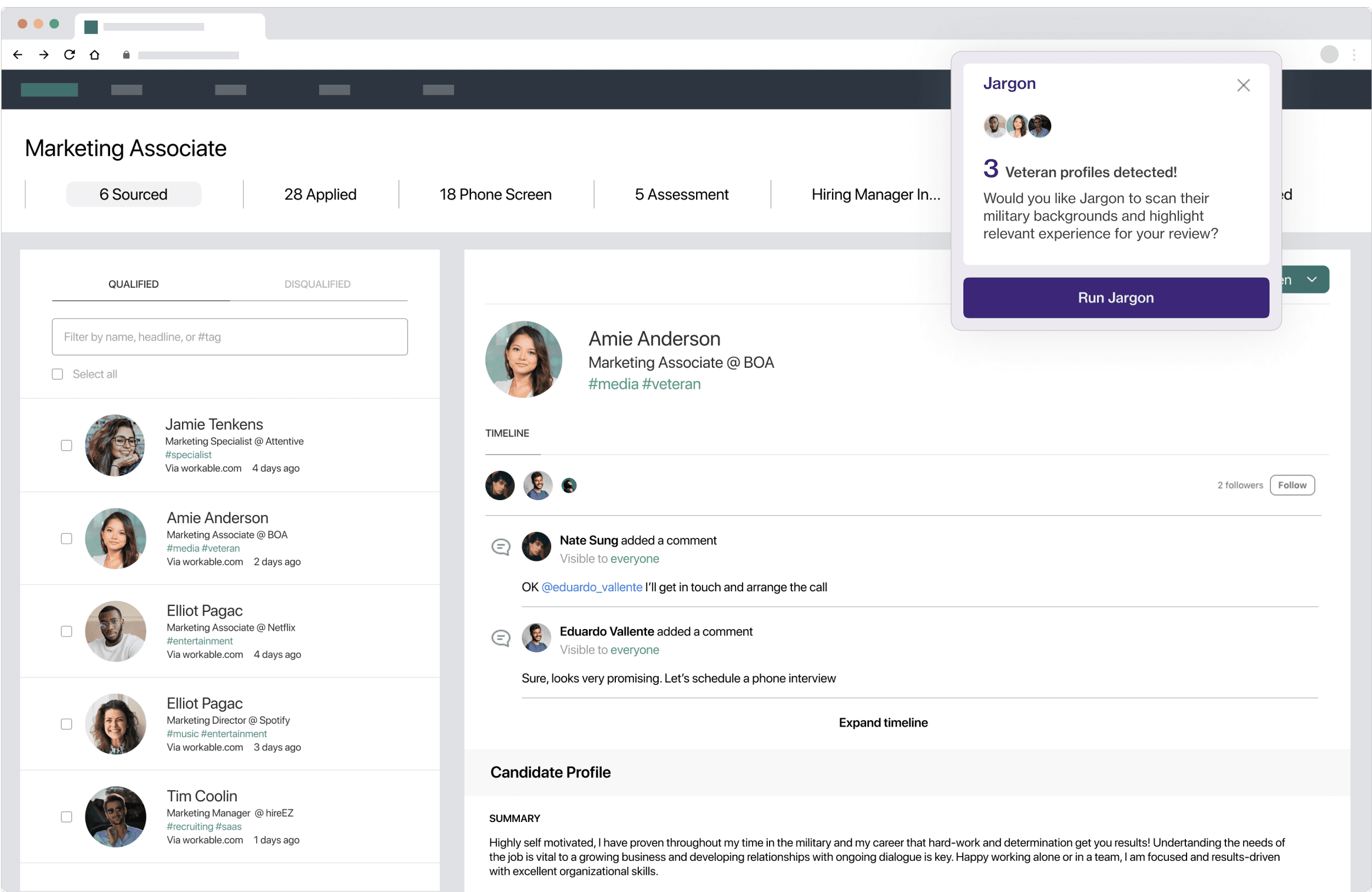
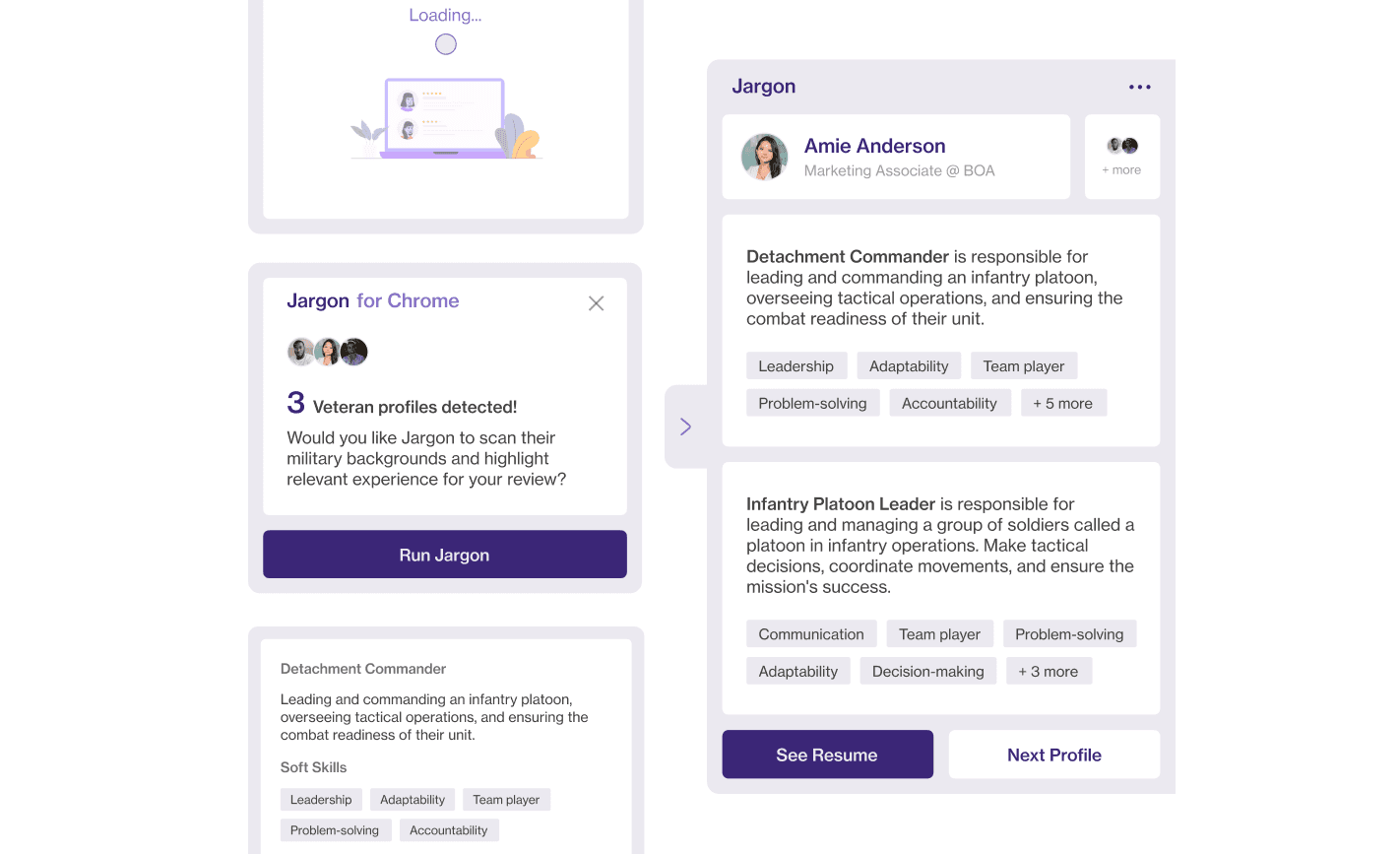
01 Auto-detect veteran candidates
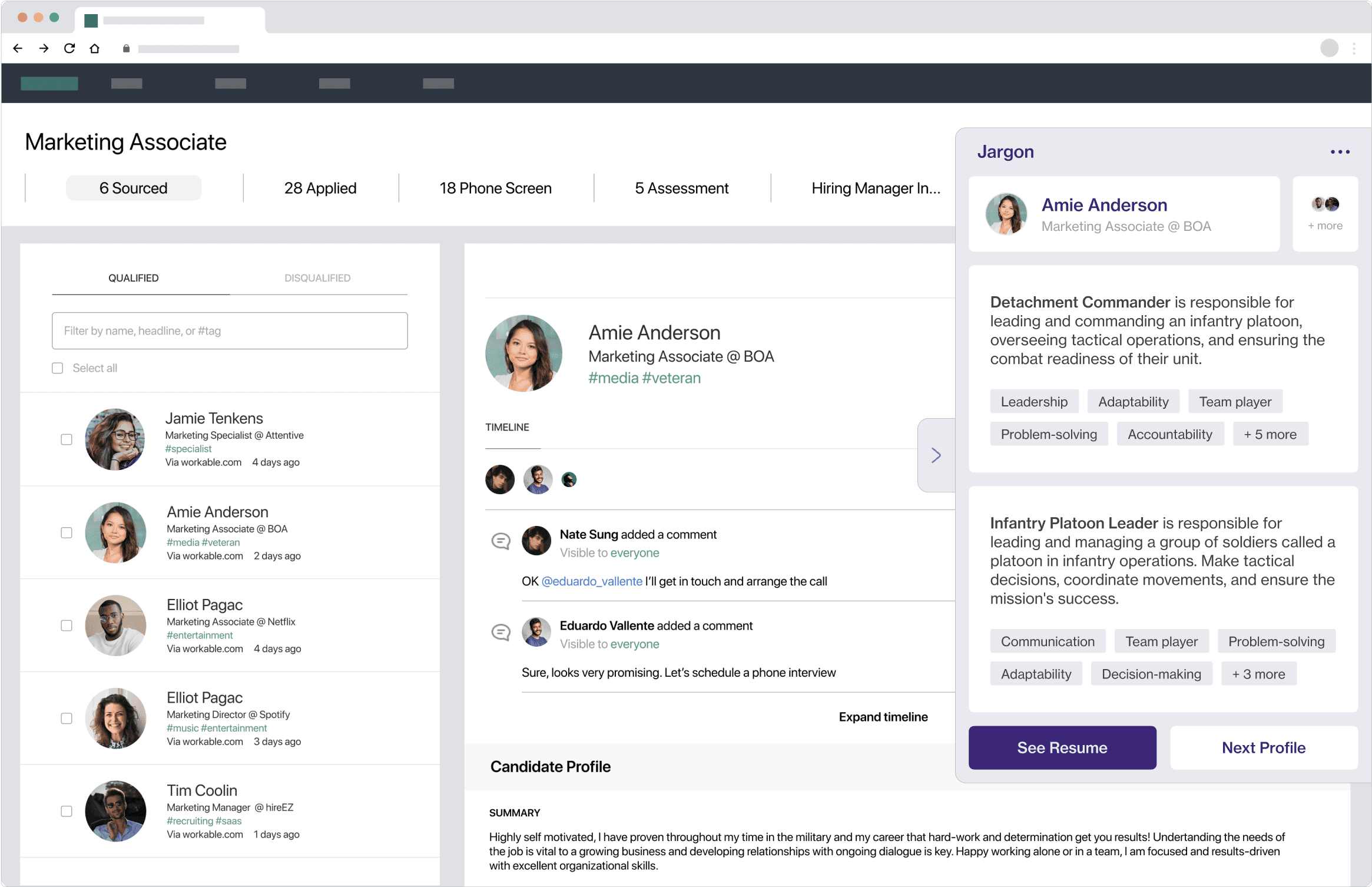
02 Quick summary highlighting soft skills
03 Easily navigate between multiple candidates
Next steps
The success of this project isn't to build a product that lasts, it's to push something out to test the market and collect user feedback. Therefore, in terms of next steps, it's crucial to document and collect those feedback, and decide how to implement changes. The greater the need for Jargon in the market, the greater the chance it could someday become an individual platform that attracts both employers and veterans.
During the time of this project, ChatGPT3.5 was popularized. And as GPT/Gen AI evolves to become specialized, it's important to understand how that impacts the vision of Jargon, as well as how to leverage the unpreventable outcomes of technological advancements!
Unique challenges
Design, product, business—all-in-one
Our client first came to us with a rather broad objective: "I want to first build something the market and user needs, and I need your help in looking into exactly what that is."
This meant I was not just designing a piece out of a system, such as a new feature, it was a complete audit and redo of the experience, which needed not only design craft, but business and product sense to understand how to go to market with a product that could potentially bridge a gap.
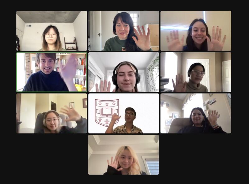
WashU 2023 Interaction Design Capstone team!
Learnings and reflections
It's okay to challenge clients
Our client came with the assumption that users needed a new SaaS platform. It wasn't easy, but I learned to challenge that with insights on why I think that may not be the case.
Go one step beyond
When posing a solution that is drastically different from what the client imagined, I found it helpful to go one step beyond and provide additional non-design related support that might come with the solution.
Storytelling is so important
When aligning stakeholders, storytelling is so helpful for setting the tone and objective for every meeting.
